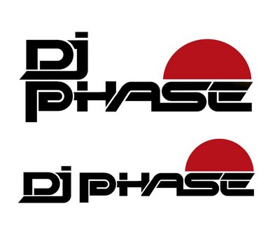
Phase Logo

Seeing as it's so quiet I've returned to an old project.. A logotype and cd cover I've been working on for my mate Dunc in his guise as DJ Phase. I managed to delete a healthy amount of worky in a bout of slightly too enthusiastic formatting a while ago, so had to backtrack a bit.
Here's the logotype. It looks quite Designers Republic but that's kind of the look I was going for. The red 'sun' ties in with the art direction of the CD cover, to follow shortly. It was also meant to reference half of a phase diagram - which looks a bit like a wave, and wasn't working for me as was.

3 Comments:
lovin’ the P
cool, I've only just found this part of your online self, the pics rock. Are you using the demon Illustrator for them?
only cos I'm jealous of the smooth lines and gradients, you unnerstan.
The demon it was.. and yeah its flaws aside that is what I like about Illustrator.. those crisp lines.
I do want to get a bit more into hand drawing again though.
Post a Comment
<< Home