Monday, January 30, 2006
Thursday, January 19, 2006
Tuesday, January 17, 2006
Batgirl Meme

As Sigh 9 pointed out, there seems to be a bit of a craze for drawing Batgirl at the minute, so I thought I'd get involved. Did something different from my usual approach, and hand drew it, then coloured it in Photoshop using my Wacom tablet.
The style's a bit like Moebius/Crumb; I like to think anyway.
Friday, January 13, 2006
Music Logos


Again a couple of blasts from the past, namely last year. The first is for my friend Dunc's night 'First Floor Funk' (it was on the first floor, right?) which we DJ'd at on a couple of ocassions. It was at the Funky Munky, which as a venue can get very cramped, so I tried to make the logotype reflect that, whilst still giving it a feeling of movement and excitement.
The second was for my friend Dave Connaly's neo-disco fusion group 'Love The Action', which consists of him, and various other scarily talented Mancs, including Stuart Whitehead and Zed Bias from Phuturistix (don't think he's a Manc though).
Wednesday, January 11, 2006
Soul Central
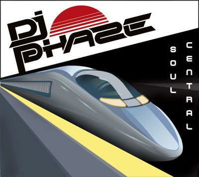
Some developments in the DJ Phaze mix CD cover. Note the 'Z' in Phaze as Duncan informs me it's 'Phaze' rather than Phase. Anyway. The image he wanted for this was a Japanese bullet train, and to this end he'd found some slightly ropey jpegs on google image search, which would break up when printing quicker than you could say "72dpi".
I had some misgivings about the content as well, but sticking with it, I went for a smooth looking vector illustration, and attempted to emphasise the perspective of the image to give it contemporary dynamic feel that reflects the music (liquid drum and bass) I also attempted to carry over the Japanese feel through the typography. The Phase logotype's angle, and paralleling of the central illustration is a tip of the hat to Tokyo design studio Power Graphixx, and with the title on the right I've attempted to reflect the layout of traditional Kanji characters.
Back and insert to follow.
Monday, January 09, 2006
Boiled Frog
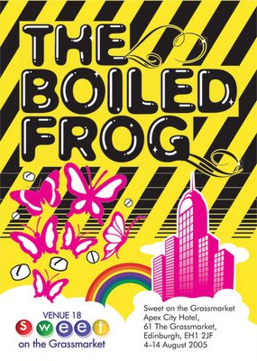
An oldie from last year. This was a flyer for a friends thatre group in Edinburgh, which got mixed reviews, but I'm told people liked the flyer.
The play was about 90s new york socialite/pyscopathic club killer Michael Alig, who was later played by McCauley Culkin in the fick 'Party Monster'. The girls in question originally wanted me to do a straight rip of a club flyer from the era - for a club called The Limelight. There were problems with this though. First off the flyers were pretty shit, and in turn were a rip off of some american cereal packet with a toucan on it. Go figure. I thought a pastiche of a pastiche was out, as who in Edinburgh knows anything about early 90s New York club flyers, or indeed early 90s American cereal packaging. No-one would get it.
Instead I opted for a Factory Records style industrial look, with a modern twist, as Peter Saville's design was an iconic look many associated with that era of clubbing, and importantly, is a visual cue I thought people in the UK would get.
It was a hell of a lot more minimal to start, but I got no amount of earache about how they wanted it 'more glam', and fair enough, Alig and his crew were as camp as Christmas.
So this is what it ended up like.
Friday, January 06, 2006
Phase Logo
Seeing as it's so quiet I've returned to an old project.. A logotype and cd cover I've been working on for my mate Dunc in his guise as DJ Phase. I managed to delete a healthy amount of worky in a bout of slightly too enthusiastic formatting a while ago, so had to backtrack a bit.
Here's the logotype. It looks quite Designers Republic but that's kind of the look I was going for. The red 'sun' ties in with the art direction of the CD cover, to follow shortly. It was also meant to reference half of a phase diagram - which looks a bit like a wave, and wasn't working for me as was.
Thursday, January 05, 2006
Beasts
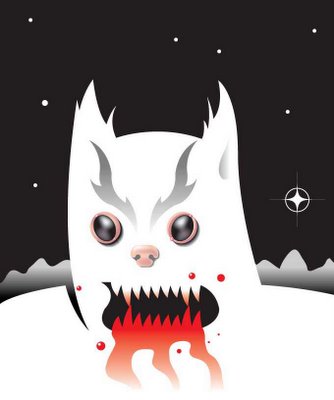

Right, first up an old 'beast' I did a while ago, followed by a more recent creature in the same style; The Space Chicken, hurtling through space. You can tell he's a space chicken by the green chevrons on his chest and the wierd sonic beam he's projecting, which I imagine is something like the chittering bleat uttered by King Ghidra, the three headed golden dragon in Godzilla.
